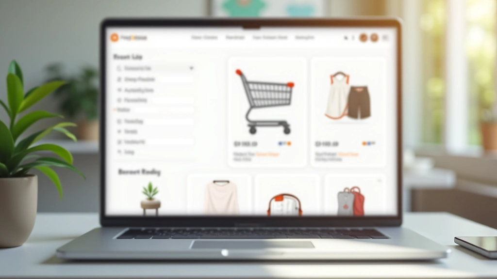
Product Card Design That Sells
How to structure product cards with the right information hierarchy. Includes image sizing, text placement, and call-to-action positioning for maximum conversions.
Read GuideMaster product cards, shopping carts, and checkout flows. Learn the design principles that increase sales for online stores in Malaysia and beyond.
These fundamentals apply whether you’re selling fashion, electronics, or services online.
Image prominence, text placement, and call-to-action positioning determine whether customers click or scroll. We break down the exact structure that works.
Item display, quantity controls, and micro-interactions prevent abandonment. Learn what reduces friction and keeps customers moving forward.
Form field organization, progress indicators, and trust signals matter. A well-designed checkout flow increases completion rates significantly.
Visual hierarchy guides customers through your catalog. Filters, sorting, and breadcrumbs create intuitive shopping experiences.
Over 70% of e-commerce traffic comes from mobile. We cover responsive design patterns that work on any screen size.
Visual consistency builds trust. Learn color psychology for e-commerce and typography that improves readability and conversions.
A step-by-step framework for creating product experiences that sell.
Start by mapping the customer journey. Are they browsing or searching? Do they compare prices? What information matters most when deciding to buy? Your design should support these behaviors, not fight them.
Organize products logically. Create categories that match how customers think. Use filtering and sorting to help people find what they want quickly. Poor navigation loses sales. Good structure keeps customers engaged.
Cards are where the magic happens. Image quality, price visibility, ratings, and CTA buttons all compete for attention. Balance them right and conversions improve. Get this wrong and people bounce.
The cart is where customers make final decisions. Clear pricing, quantity controls, and trust indicators reduce hesitation. Make removing items easy too—it builds confidence that they’re in control.
Fewer form fields mean higher completion rates. Progressive disclosure works—ask for information only when needed. Show progress, offer multiple payment methods, and display security badges. Every friction point costs sales.
Design isn’t finished at launch. Track user behavior, identify drop-off points, and test improvements. A/B testing on cards, buttons, and layouts reveals what actually works for your audience.
Practical guides you can use to improve your online store right away.

How to structure product cards with the right information hierarchy. Includes image sizing, text placement, and call-to-action positioning for maximum conversions.
Read Guide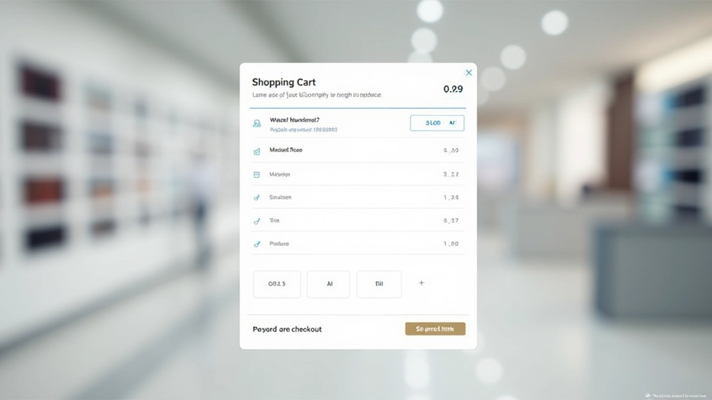
What makes a shopping cart easy to use. We’ll cover item display, quantity controls, coupon fields, and those crucial micro-interactions that prevent cart abandonment.
Read Guide
The science behind checkout flows. Learn how form field organization, progress indicators, and trust signals reduce friction and increase completed purchases.
Read GuideAnswers to questions we hear from designers and store owners building online businesses.
Grid view works best for visual products (fashion, home decor, electronics). List view suits comparison-heavy categories (specifications matter more than appearance). Many successful stores let customers toggle between both views. Mobile typically defaults to single-column list due to screen space constraints.
Square images (1:1 aspect ratio) are standard for product cards because they’re efficient and work across devices. Ensure images are at least 400400px for desktop clarity. Always provide alt text describing the product. Lazy loading improves performance when displaying hundreds of products.
Quantity buttons (plus/minus) prevent typos and feel more controlled. However, include an editable input field for customers who want to type large quantities. Some designers use spinners—these work on desktop but aren’t ideal on mobile. Test both approaches with your audience.
Research suggests 3-4 steps feels optimal: Cart Review Shipping Payment Confirmation. Fewer steps can feel rushed. More than 4 increases abandonment. Express checkout options (one-click, Apple Pay, Google Pay) reduce friction for returning customers who don’t need all fields.
Essential: product image, name, price. Recommended: rating/reviews, sale badge if applicable. Optional: quick view button, wishlist button, in-stock indicator. Avoid cluttering cards—focus on what drives purchase decisions. Test variations to see what your customers respond to.
Stack form fields vertically (not side-by-side). Use large touch targets for buttons. Minimize keyboard switches—number fields for zip codes, email fields for addresses. Show progress visually. Offer mobile payment options like Apple Pay or Google Wallet. Test on actual devices, not just browser emulation.
People using these design principles to build better online experiences.
“I wasn’t confident about redesigning our product cards, but these guides broke everything down step-by-step. After implementing the new hierarchy, our click-through rate jumped by 18%. The specific examples for Malaysian e-commerce stores really helped—it’s not generic advice.”
“The checkout optimization guide is solid. I’d been guessing about form fields and button placement. Now I understand the ‘why’ behind each decision. We’re testing the new flow this week and honestly the theory makes sense—fewer fields, clearer progress, better trust signals.”
“Our team used the shopping cart design principles and it’s made a real difference. We’re getting fewer support tickets about cart confusion. The micro-interactions feel natural, and customers aren’t accidentally adding wrong quantities anymore. Best part? It didn’t require a full rebuild.”
Whether you’re launching a new store or redesigning an existing one, we’ve got resources and expertise to help. Get personalized guidance on product cards, shopping carts, checkout flows, and category pages.
Start Your Project